Plotting Big Data and Alpha
When plotting too many data points, we use alpha= because points are overlapped and indistinguishable.
library(dplyr)
library(data.table)
library(cowplot)
library(ggplot2)

#N <- 1000
N <- 1000000

x <- rnorm(N)
y <- x + rnorm(N)


dat <- data.table(x = x,
                  y = y)
dat %>% ggplot(aes(x=x, y=y)) +
geom_point() +
labs(title='Original plot')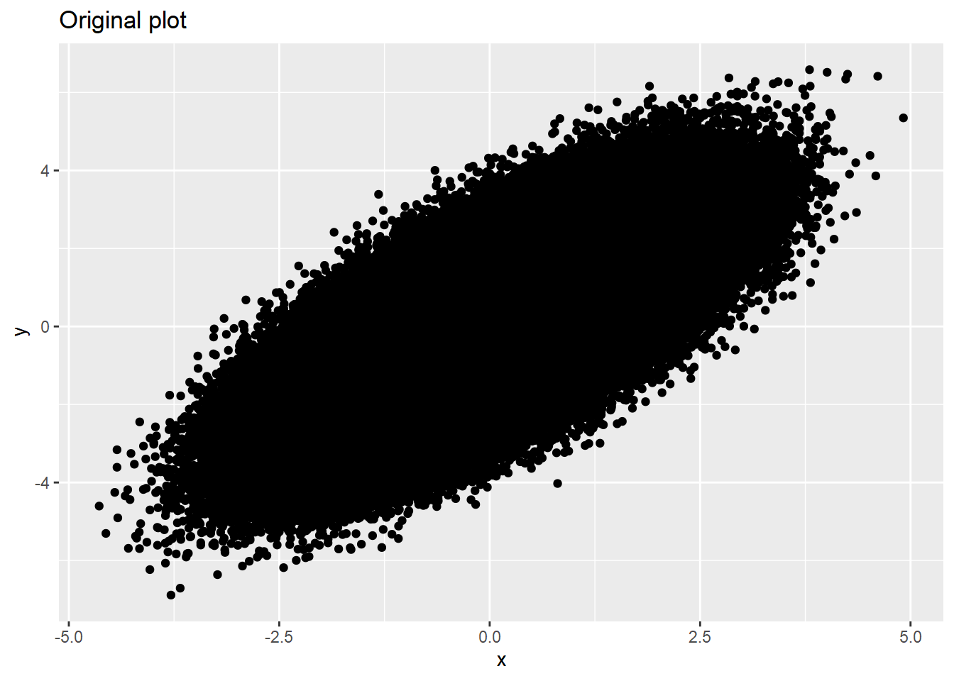
dat %>% ggplot(aes(x=x, y=y)) + geom_point(alpha=0.01) +
  labs(title='Using alpha=0.01')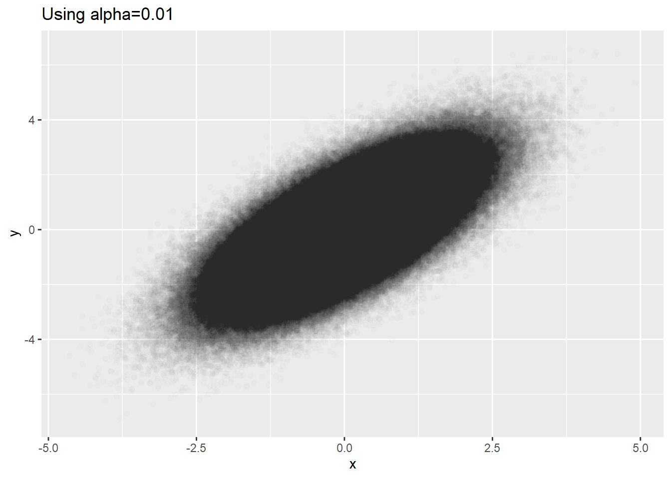
Meaningful minimal alpha seems to be 0.01 for ggplot2. For very big data, alpha=0.01 is not small enough. Looking at the plot the above, we see big blackness in the center. This might be that the densities in the center are the same or it might be that they reached to the ceiling of blackness even if the densities are not equal.
Bivariate normal distribution is too simple. Let’s try more complex data.
x1 <- rnorm(N/2)
y1 <- 2*sin(x1) + rnorm(N/2)
x2 <- rnorm(N/2)
y2 <- 2*cos(x2) + rt(N/2, df=30)

dat <- data.table(x=c(x1,x2),
                  y=c(y1,y2))
Using multiple alphas
We can use multiple alphas to avoid the problem of ceiling effect of constant alpha.
p1 <- dat %>% ggplot(aes(x=x, y=y)) + geom_point() +
  labs(title='alpha=1') + theme_minimal()
p2 <- dat %>% ggplot(aes(x=x, y=y)) + geom_point(alpha=0.1) +
  labs(title='alpha=0.1') + theme_minimal()
p3 <- dat %>% ggplot(aes(x=x, y=y)) + geom_point(alpha=0.05) +
  labs(title='alpha=0.05') + theme_minimal()
p4 <- dat %>% ggplot(aes(x=x, y=y)) + geom_point(alpha=0.01) +
  labs(title='alpha=0.01') + theme_minimal()

plot_grid(p1,p2,p3,p4,ncol=2)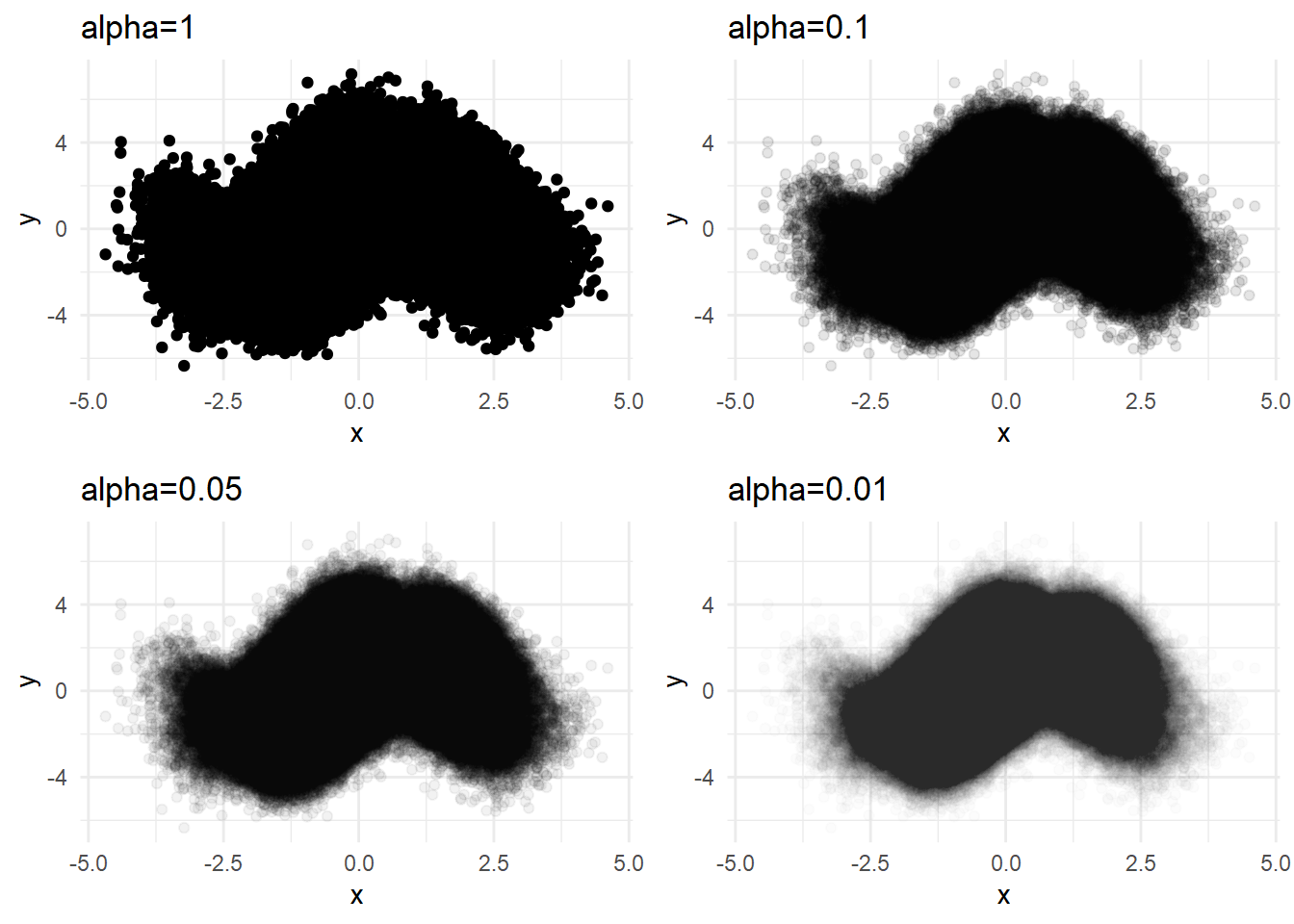
But using the minimal alpha=0.01 does not reveal the density differences in the center. We can try sampling in this case.
Sampling
p1 <- dat %>% sample_n(N/5) %>%
  ggplot(aes(x=x, y=y)) + geom_point(alpha=0.01) +
  labs(title='alpha=0.01 with 20% of data') + theme_minimal()
p2 <- dat %>% sample_n(N/10) %>%
  ggplot(aes(x=x, y=y)) + geom_point(alpha=0.01) +
  labs(title='alpha=0.01 with 10% of data') + theme_minimal()
p3 <- dat %>% sample_n(N/50) %>%
  ggplot(aes(x=x, y=y)) + geom_point(alpha=0.01) +
  labs(title='alpha=0.01 with 2% of data') + theme_minimal()
p4 <- dat %>% sample_n(N/100) %>%
  ggplot(aes(x=x, y=y)) + geom_point(alpha=0.01) +
  labs(title='alpha=0.01 with 1% of data') + theme_minimal()
library(cowplot)
plot_grid(p1,p2,p3,p4,ncol=2)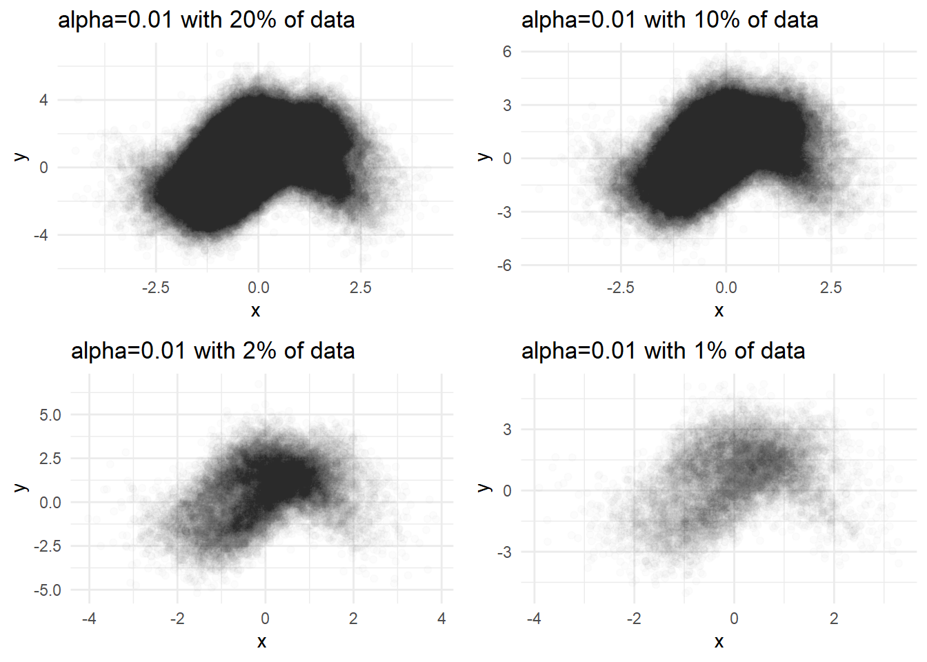
But sampling utilizes only some part of the data. It depends on the chance so the results are different every time we plot.
Contidional density plot
There are several reason for plotting. One reason is doing EDA(Exploratory Data Analysis) before doing regression analysis such as linear model, ML, and DL.
The important thing in this case is to see what conditional density \(\mathbb{p}(y|x)\) is like. Besides all plots above are focused on bivariate density.
To visualize the expectation of \(y\) conditional on \(x\) , non-parametric regression line in the following would help.
Regression line
p1 <- dat %>% sample_n(N/100) %>%
  ggplot(aes(x=x, y=y)) + geom_point(alpha=0.01) +
  geom_smooth(method='loess') +
  labs(title='alpha=0.01 with 1% of data, loess') + theme_minimal()
p2 <- dat %>% sample_n(N/100) %>%
  ggplot(aes(x=x, y=y)) + geom_point(alpha=0.01) +
  geom_smooth(method='auto') +
  labs(title='alpha=0.01 with 1% of data, gam') + theme_minimal()
print(p1)
## `geom_smooth()` using formula 'y ~ x'print(p2)## `geom_smooth()` using method = 'gam' and formula 'y ~ s(x, bs = "cs")'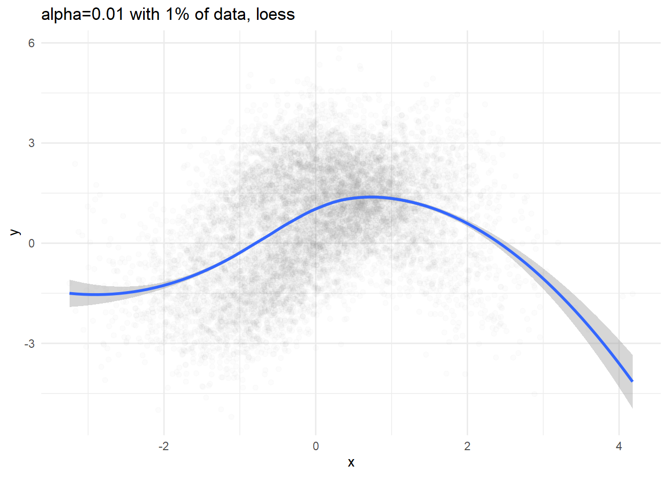
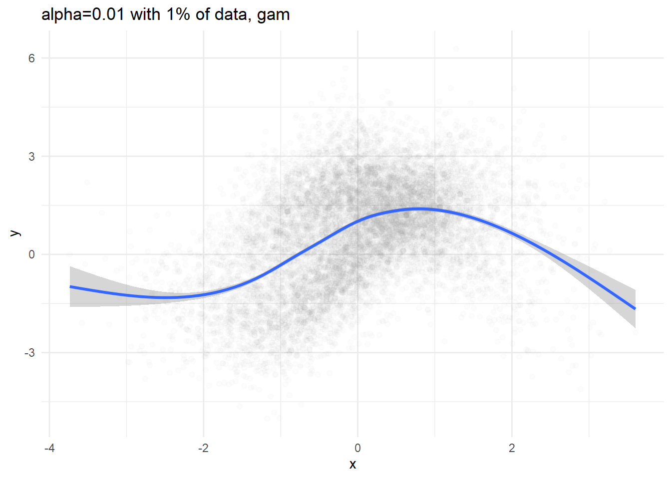
We can definitely see conditional expectation( \(\mathbb{E}[y|x] = \int y\ \mathbb{p}(y|x) dy\) ), but we cannot figure out what the conditional density would be like.
Conditional density
binning \(x\)
As we saw above, using small constant alpha prevents us from identifying the density difference when the points are too gathered and identifying data points where data points are so scarce. One possible solution would be binning \(x\) and sampling.
dat %>%
  mutate(xCut = cut(x, breaks=10)) %>%
  group_by(xCut) %>%
  do(sample_n(., 10000, replace=TRUE)) %>%
  ggplot(aes(x=x, y=y)) +
  geom_point(alpha=0.01)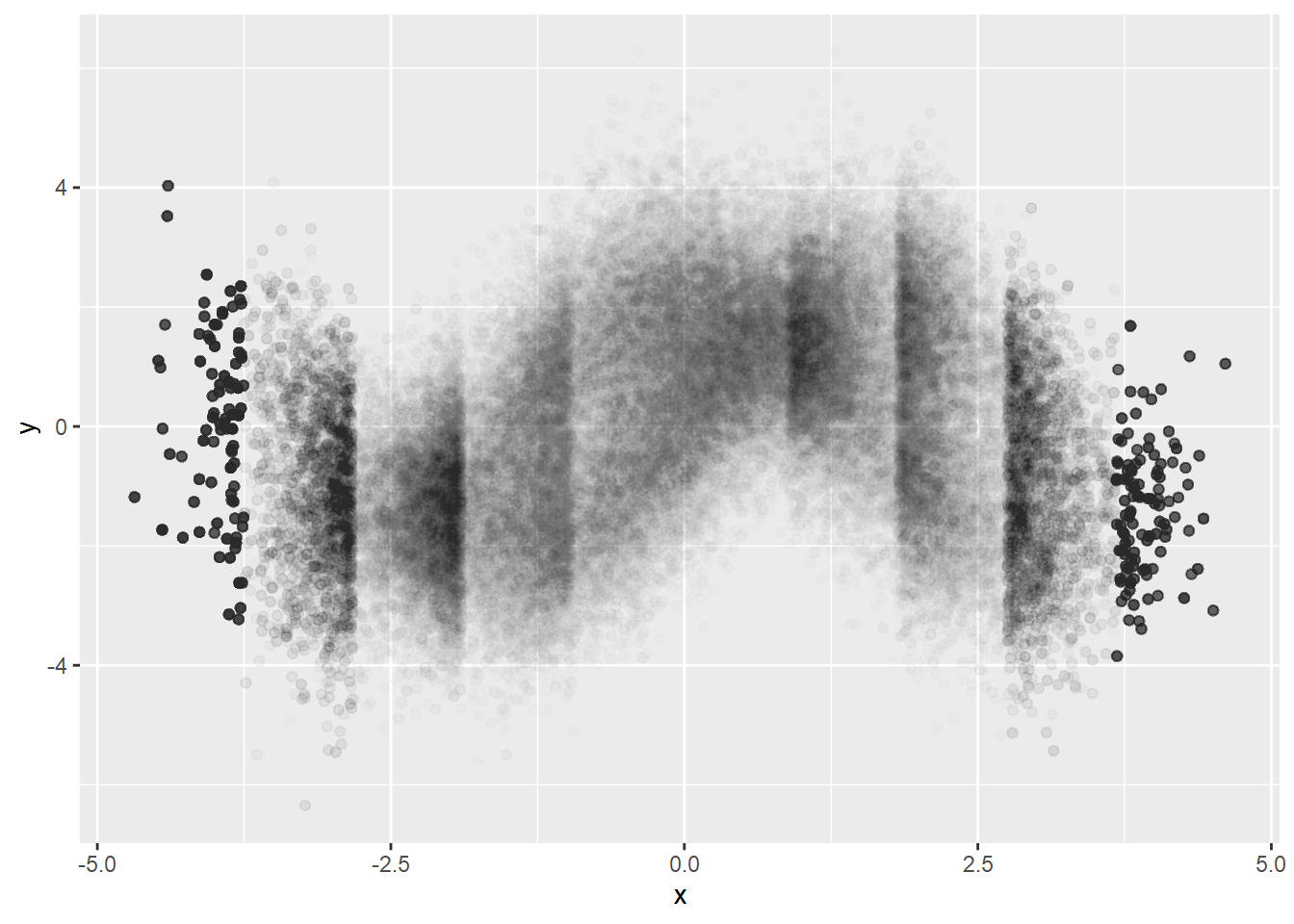
Better visualizing of conditional density but we can see artifacts. It must be because of too big bin size. Let’s try smaller bin size.
dat %>%
  mutate(xCut = cut(x, breaks=50)) %>%
  group_by(xCut) %>%
  do(sample_n(., 2000, replace=TRUE)) %>%
  ggplot(aes(x=x, y=y)) +
  geom_point(alpha=0.01)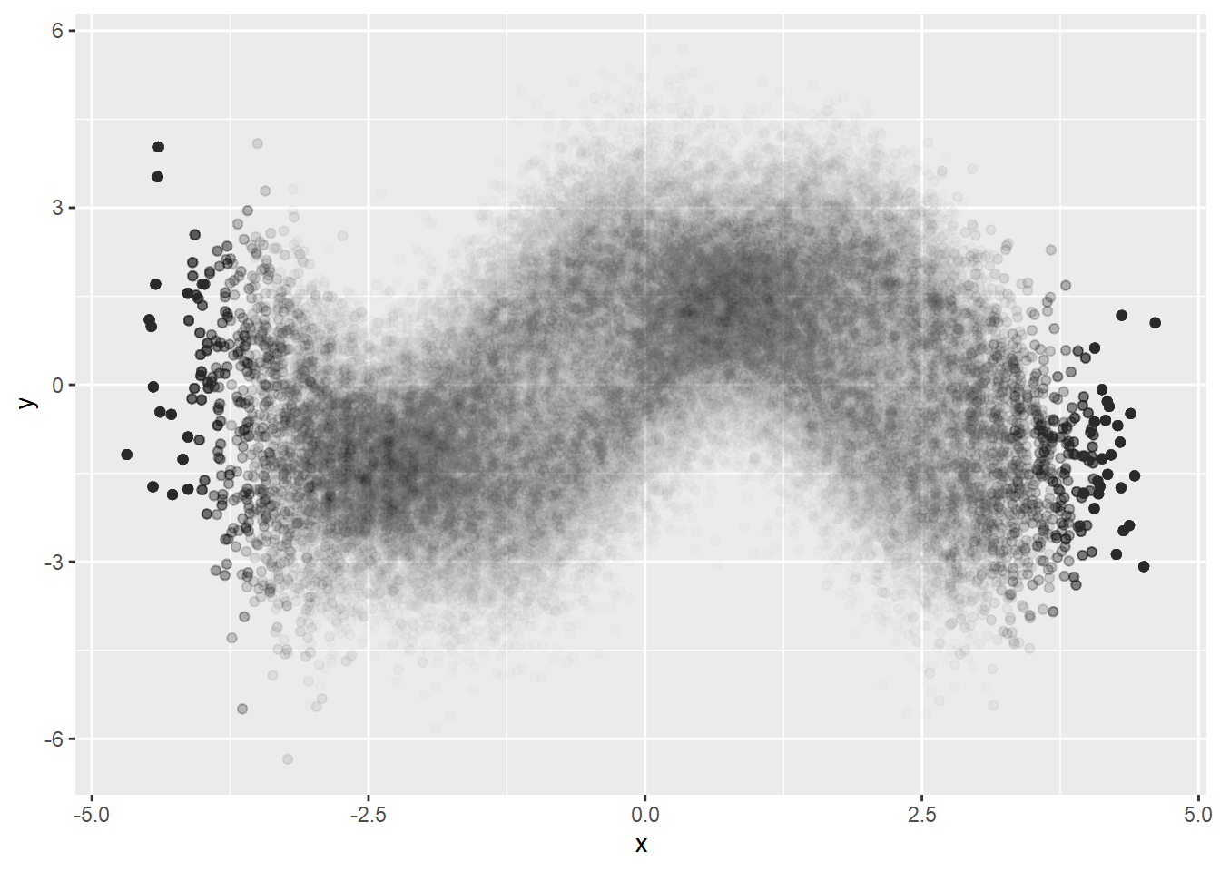
Estimating density of \(x\)
We can never say what is the best bin size. We would better estimate the probability density function of \(x\).
We also treated every \(x\) as identical. We might take estimated probability function of \(x\) into consideration, either using probability function itself or some function(ex. \(\log\) ) of it.
xDensity <- ks::kde(dat$x)
dat$prob <- predict(xDensity, x = dat$x)

#head(dat)
dat %>%
  mutate(xCut = cut(x, breaks=50)) %>%
  group_by(xCut) %>%
  do(sample_n(., 2000, replace=TRUE, weight=1/prob)) %>%

  ggplot(aes(x=x, y=y)) +
geom_point(alpha=0.01) 